H+dM's Cottbus University Library
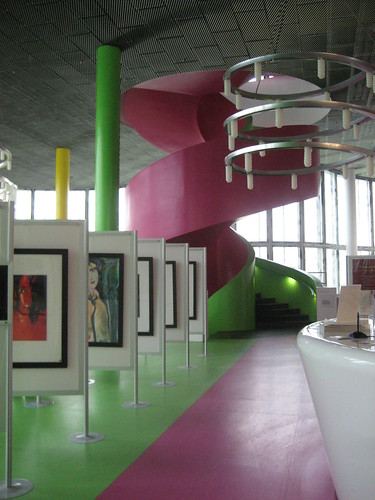
Interior of Herzog & de Meuron's Cottbus University Library (Germany)
The exterior (not shown) is an image comprised of overlaid letters... accumulated to the point where the letters are unintelligible, yet still recognizable as typography. The floor plates are overlaid/pained with the pure tones of a tv test-pattern, which serves several goals:
1. The mapping of the tv image onto the floor could be seen as a highly conceptual architectural move, encouraging the viewer to examine the relationship between the image (tv) and text (the facade / the stacks). Note that the facade is an example of text-becoming image. Is the coloring of the floor an example of image-becoming-text?
2. The color mapping / supergraphics of the tv-test pattern seems at first to be quite arbitrary, yet it could be understood as an overcoding - an additional organization system that exists outside of the organization of the stacks, and outside the organization of the building, yet can serve to reinforce both in unexpected ways. First of all, the floor plan of the building is rather amorphous, and there is little differentiation in the architecture itself. These ordered bands of color add order via experiential narrative -you enter (blue), take the stairs (purple/lime), find your book (orange), then retrace your steps, using the color as an aid.... perhaps it's not that complicated, but merely having one stair core in one color zone and the second in another helps the confused visitor orient himself.
(photo by Tyler)

1 comment:
let's hear it for juicy and kilobyte green!
Post a Comment